 Recraft 团队
Recraft V4 的底层训练逻辑直接对标视觉设计师的工作方式。无论你只给出一句简短的画面意图,还是像写设计任务书一样详尽规定构图、风格系统、字体层级与制作约束,模型都能输出符合专业设计水准的画面。
在实际项目中,这两种写法各有分工:当你还在摸索造型、情绪或构图方向时,短提示词足以快速打开思路;当你已经确定了视觉规范,需要控制版式结构、色彩体系、字效表现或量产一致性时,结构化长提示词就能帮你锁定画面细节。
这份实战指南聚焦于日常设计工作流:提示词的长度、结构与细节深度如何影响最终画面,以及面对摄影、矢量图形、海报排版、插画、3D 渲染与包装字效等不同任务时,如何选择最合适的提示词写法。
导读:设计师写出稳定可控生图提示词的 4 个核心要点
- 先分清「短提示词探索」与「8 步长提示词锁架构」:前期找灵感用 4–6 个词的短提示词让模型发挥审美直觉;定稿阶段按「核心概念 → 背景环境 → 主体构图 → 外貌材质 → 空间关系 → 光线行为 → 镜头景深 → 情绪与负向约束」从全局到局部逐层锁定。
- 不同视觉媒介要抓准各自的控制支点:摄影看镜头焦段与布光方向,平面矢量靠几何剪影与配色克制,插画重笔触肌理与色彩冷暖,3D 渲染则取决于物理材质与重力互动。
- 海报与排版采用「三层提示词架构」:先把背景网格层、图形/摄影主体层、文字排版层拆开独立定义,再明确写清层与层之间的穿插遮挡关系(如花茎穿过字母、蜡笔涂鸦压过网格线)。
- 画面里的文字先声明物理载体:无论是刺绣标、金属铭牌还是复古包装盒,先规定文字附着的材质、印刷工艺与版式对齐方式,才能避免文字像后期生硬贴上去的图层。
一、短提示词 vs. 结构化长提示词:探索美学与锁定架构
1. 短提示词 → 直觉探索模式(Interpretive Mode)
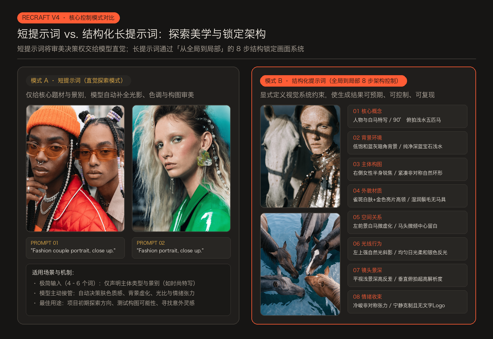
当你只输入极少的信息时,Recraft V4 会自动补全审美决策,主动接管光影、色调、模特造型与镜头语言。比如下面两条仅有 4 到 5 个单词的提示词:
Fashion couple portrait, close up.- 中文释义:时尚双人肖像,特写景别。
- 画面表现:模型自动构建了高饱和橙色针织帽与红色亮面羽绒服的撞色造型,搭配琥珀色墨镜、珍珠配饰与柔和的高光肤质,形成极具杂志感的人物关系。
Fashion portrait, close up.- 中文释义:时尚单人肖像,特写景别。
- 画面表现:模型自行选择了冷调青蓝背景与亮绿色皮质服装的对比,赋予人物蓬松金发、通透淡青眼影与雕塑感耳饰,眼神与姿态自然松弛。
2. 结构化长提示词 → 建筑级精确控制(Architectural Control)
如果你追求精确可控的画面,就需要在提示词里直接定义整套视觉系统。来看下面两个高复杂度摄影案例:
案例 A:人物与白马的冷峻肖像
Artistic close-up portrait of a young Caucasian woman and a pale horse against a dark desaturated blue-grey background with subtle vignetting. The woman stands on the right in sharp head-and-torso focus, slightly angled left, looking directly into the camera with a serious, neutral expression. Fair freckled skin, light reddish-brown hair pulled back, light eyes, no jewelry. She wears a high-neck metallic gold sequined garment over a dark brown layer, reflecting soft golden highlights.
In the left foreground, slightly behind her, the pale horse’s head is softly out of focus but clear in form — white coat with faint speckles, light mane, visible eye, no tack. Strong natural light from the upper left creates sharp diagonal shadows and warm highlights against the cool background. Shallow depth of field, high contrast, eye-level composition, asymmetrical and intense mood.- 核心概念与背景:年轻白人女性与浅色骏马的艺术特写肖像,置于带轻微暗角的低饱和深蓝灰背景前。
- 主体站位与外貌:女性位于画面右侧,头肩部处于锐利焦点内,身体微向左倾,目光平静冷峻地直视镜头;白皙雀斑皮肤、红棕色束发、浅色瞳孔、无任何首饰,身穿深棕内搭与金属感金色亮片高领服饰,折射柔和金光。
- 次要主体与空间关系:左前方略靠后的位置是浅色马头,焦点微虚但轮廓清晰——带浅斑的白色皮毛、浅色鬃毛、眼睛可见、无笼头马具。
- 光线与镜头收束:左上方投射的强自然光在冷调背景上切出锐利的对角线阴影与暖调高光;平视机位、浅景深、高反差,整体呈非对称的冷峻张力。
案例 B:90° 垂直俯拍浅水五匹骏马
Hyper-realistic aerial wildlife photography capturing a calm, graphic close-range moment of five horses gathered in shallow water, viewed from a perfect 90° top-down perspective. The framing is tight: their heads, necks, and upper backs fill most of the frame, emphasizing scale and physical presence. The horses stand very close together in a loose, imperfect circular arrangement with organic spacing — not mathematically symmetrical. Some heads angle slightly inward while others tilt subtly off-center, creating a spontaneous, natural composition. They are calm and still, gently lowering their heads toward the water. The horses are completely natural with no reins, bridles, or harnesses; manes flow freely and appear slightly damp at the edges.Clear shallow water fills the entire frame with no shoreline or external elements visible. The palette is deep and cool: water rendered in rich sapphire blue with soft indigo gradients and muted silver reflections from sunlight. Horse coats appear in cool, desaturated tones — ash gray, charcoal brown, cool slate, and muted chestnut with subtle bluish undertones. Fine ripples form around each muzzle, with slight distortion visible beneath the water surface. Bright, even natural daylight creates soft reflections and gentle highlights across wet coats. Ultra-high-resolution photorealism with visible mane strands, subtle coat variations, and a slight wet sheen on their backs. The composition remains minimal and graphic, with subtle negative space in the center and a mood of natural calm, organic imperfection, quiet unity, and serene strength. No text, no logos, no references.- 机位与构图尺度:超写实航拍野生动物摄影,以绝对垂直的 90° 俯视角度近距离捕捉五匹骏马聚集在浅水中的平静瞬间;紧凑取景让马头、马颈与上背部填满画幅,5 匹马呈自然松散的非对称环形排列,中心留出微妙的负空间。
- 主体状态与细节:无任何缰绳或鞍具,鬃毛自然垂落且边缘微湿,马头轻轻低向水面,鼻吻周围泛起细密涟漪。
- 色彩与光影控制:整个画面被清澈浅水填满,不露岸线;水面呈浓郁的蓝宝石色与柔和靛蓝渐变,带阳光折射的柔和银光;马匹皮毛统一在冷调低饱和色系(灰白、炭棕、冷岩灰与带蓝调的暗栗色)。
- 负向约束:明确声明
No text, no logos, no references(无文字、无标志、无外部杂物)。
3. 从全局到局部的 8 步提示词架构
编写结构化提示词时,最高效的顺序是从画面整体逐步收拢到局部细节:
- 核心概念(Core concept):画面里有什么主体与场景。
- 背景与环境(Background and environment):主体所处的空间背景。
- 主体的构图与姿态(Primary subject framing and pose):站位、取景范围、动作与神态。
- 外貌与材质特征(Physical attributes and identity details):肤质、发型、服饰材质与细节。
- 次要主体与空间关系(Secondary subjects and spatial relationships):前景、后景元素与主体的前后遮挡或呼应关系。
- 光线方向与物理表现(Lighting direction and behavior):光源角度、软硬度、投影形状与高光反射。
- 相机、景深与反差(Camera, depth, and contrast):机位角度、焦段、景深虚实与明暗对比。
- 整体情绪与构图收束(Mood and compositional resolution):画面氛围基调及负向排除项。
核心判断准则:结构化长提示词并不是为了让画面变得“更好看”,而是为了让结果符合预期、细节可控、稳定复现。如果画面必须严格匹配既定的美术指导方案,请使用结构化提示词;如果处于前期发散探索阶段,保持极简即可。
二、摄影类提示词:电影感镜头调度 vs. 生活方式纪实抓拍
1. 设计师电影感(Designer Cinematic):靠光线、镜头与动态建立控制
电影感画面的核心不在于戏剧化的夸张情节,而在于对光线、机位焦段与动静对比的精准调度。写提示词时,重点描述画面是“如何被拍摄出来的”,而不是空泛地形容它“有多震撼”。
案例 A:暗室角落的流动冷蓝焦散光斑
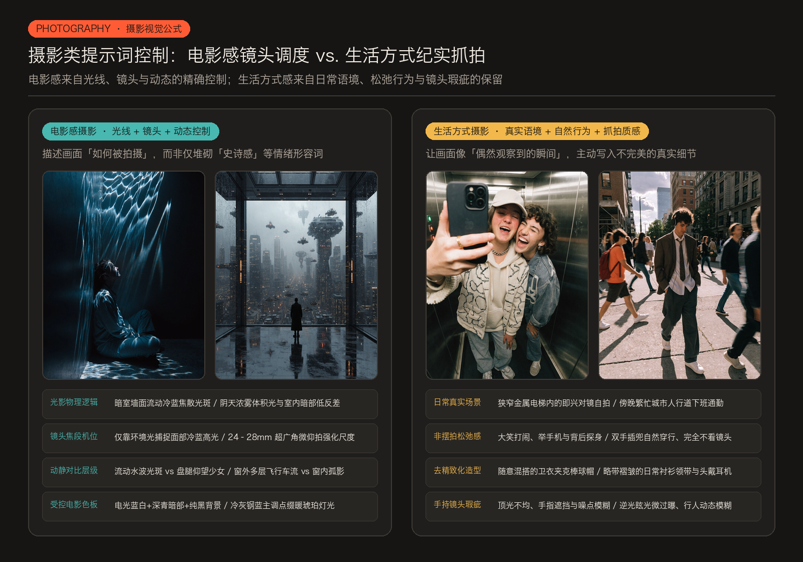
Cinematic portrait photography, natural light, dark atmospheric. A young woman sitting cross-legged on the floor in the corner of a completely dark room, back against the wall, face tilted upward. On the wall behind and above her: extraordinary caustic light patterns — shifting organic shapes of cold blue-white and pale teal light moving across the wall surface as if projected by water or glass, the patterns constantly implied in motion, wrapping around her figure and the corner of the room. The light source completely invisible — the patterns appearing from nowhere, covering the wall in luminous abstract forms that look simultaneously natural and impossible. Her face catching fragments of the shifting light — one cheekbone lit in cold blue, the rest of her in deep shadow. The floor around her also catching scattered light fragments. She is not afraid. She is watching something above her that we cannot see. Color palette: cold electric blue-white caustic patterns, deep teal shadows, pure black room, pale skin fragments. Shot on available light only. The feeling: something has entered the room through the walls.- 场景与主体姿态:全黑房间角落,年轻女性背靠墙面盘腿坐在地板上,仰起脸庞望向画外上方。
- 光影物理行为:身后与头顶墙面浮现如水波或玻璃折射般的焦散光斑(Caustic light patterns),冷蓝白色与浅青色有机光影包裹住人物与墙角;她的一侧颧骨捕捉到冷蓝碎光,其余部分没入深邃暗部。
- 色板与拍摄约束:电光冷蓝白光斑 + 深青色阴影 + 纯黑房间 + 苍白肌肤碎片,仅靠现场环境光拍摄(
Shot on available light only)。
案例 B:未来巨型都市落地窗前的孤独剪影
Interior scene in a vast ultra-modern penthouse overlooking a sprawling futuristic megacity, a floor-to-ceiling panoramic window spanning the entire wall, with a lone figure in silhouette observing massive multi-level air traffic — large hovering carriers, drones, and distant convoys moving through layered city airspace. Heavy overcast sky with dense atmospheric haze, diffused daylight blending with subtle artificial glow, soft volumetric light cutting through fog, low contrast between cool exterior tones and dim interior shadows. Ultra-wide cinematic framing from a slightly low angle using a 24–28mm lens emphasizes monumental scale and spatial depth, with the interior foreground framing the expansive exterior. Outside, layered motion unfolds — slow drifting structures, steady traffic streams, distant blinking lights — contrasted by stillness inside. Endless skyscrapers fade into atmospheric perspective, the skyline dissolving into fog, creating strong separation between the silhouette and the vast environment. Controlled cinematic palette of cold grays and steel blues, punctuated by warm amber accents, conveying a mood of epic scale and quiet futurism — isolation within a vast, living system.- 空间与主体对比:超现代顶层公寓室内,整面全景落地窗俯瞰无边无际的未来巨型都市;窗前伫立一个孤独的人物剪影,凝视窗外多层空中交通(悬浮母舰、无人机与远方航队)。
- 相机与焦段语言:使用
24–28mm超广角镜头配合微仰拍机位,利用室内前景框住窗外巨型尺度,通过浓雾的大气透视拉开人物剪影与远景摩天楼群的空间分离度。 - 动静与色彩分级:窗外缓慢漂移的飞行器、车流与闪烁航灯形成多层动态,与室内的绝对静止形成反差;冷灰与钢蓝的主色调中点缀温暖的琥珀色灯光。
电影感摄影的 7 项结构要素:
- 场景类型(Scene type):影棚、街头、自然风光、室内空间。
- 核心主体(Main subject):人物、物体或正在发生的动作。
- 布光设置(Lighting setup):自然光、定向光、时间段、明暗反差。
- 镜头语言(Camera language):机位高低、镜头焦段、取景画幅。
- 动态处理(Motion treatment):高速凝固、动态模糊、长曝光、微风吹拂或肢体趋势。
- 背景表现(Background behavior):景深虚实、大气雾感、前景与背景的空间剥离。
- 色彩体系(Color palette):克制的色调范围与电影感调色(Color grading)。
2. 生活方式纪实摄影(Designer Lifestyle):保留真实语境与抓拍呼吸感
生活方式类摄影最怕“摆拍感”。要想让画面自然松弛,提示词需要重点交代日常情境、非摆拍的自然动作,以及手持或手机拍摄特有的不完美质感,让画面像是偶然观察到的生活切片。
案例 A:狭窄电梯里的好友对镜自拍
Casual everyday moment inside a small elevator, two young people taking a spontaneous mirror selfie together, laughing and messing around, one holding the phone while the other leans in close from behind. They wear casual streetwear — a cap, jacket, hoodie — slightly mismatched and unstyled. Harsh overhead elevator light creates uneven illumination with soft shadows and slight grain, typical phone camera look. Shot directly into the mirror, centered but imperfect framing with fingers partially covering the phone, slight blur and compression artifacts. Background is minimal — metallic walls, tight space, reflections. Mood is playful and unfiltered — a quick, intimate moment between friends captured without thinking.- 日常情境与互动:狭窄金属电梯内,两个年轻人即兴对镜自拍、大笑打闹,一人举着手机,另一人从背后凑近镜头。
- 去精致化造型:棒球帽、夹克、连帽卫衣等日常街头穿搭,明确声明
slightly mismatched and unstyled(略微混搭、未经刻意造型)。 - 手机镜头的真实瑕疵:刺眼的电梯顶光造成光线不均与轻微颗粒感,直对镜面拍摄,手指半遮住手机机身,保留轻微失焦与手机画质压缩痕迹。
案例 B:傍晚城市人行道上的下班通勤者
Everyday urban street scene during late afternoon in a busy city, a young man walking through a crowd on a sidewalk wearing simple office clothing — shirt, tie, jacket, and headphones — moving naturally with hands in pockets, not posing, just passing through. Casual, slightly unpolished look with lightly wrinkled clothing and no styling. Natural sunlight from behind creates warm glare, mild overexposure, and uneven lighting across the frame. Shot handheld at eye level with a candid feel, slightly off-center, with mild motion blur from passing pedestrians and imperfect focus on the subject. The background is messy and layered with people, buildings, and street activity, with no strong separation. Real-world details like long shadows, uneven pavement light, and random figures mid-step. Mood of routine and detachment — an ordinary, unfiltered moment of city life.- 日常语境与行为:傍晚繁忙的城市人行道,身穿普通衬衫、领带、西装外套并戴着头戴式耳机的年轻男子双手插兜穿行在人群中,强调
not posing, just passing through(不摆拍,只是路过)。 - 造型与光线细节:衣物带有轻微自然褶皱;身后斜射的夕阳带来温暖眩光与轻微过曝。
- 抓拍构图与环境杂乱感:平视手持抓拍,主体略微偏离中心,路人带有轻微动态模糊,背景保留真实的街道人流、建筑与斑驳长影,不强行做大光圈虚化剥离。
生活方式摄影的 7 项结构要素:
- 生活语境(Context):具体的日常场景与空间环境。
- 核心主体(Main subject):人物、群体或正在被真实使用的产品。
- 自然行为(Action or interaction):真实的动作互动,明确拒绝摆拍。
- 造型完备度(Styling):服装、随身物品及“去精致化”的程度。
- 环境光线(Lighting):柔和自然光、室内环境光或特定时间段的光照。
- 抓拍构图(Composition):取景范围、抓拍角度与镜头距离。
- 真实生活痕迹(Environment details):使用痕迹、杂乱背景与随机路人细节。
三、平面矢量图形与风格化插画:几何剪影纪律 vs. 绘画色光系统
1. 矢量图形与 Logo 设计(Vector & Logo Design):扁平结构与零材质纪律
Recraft V4 在扁平图形逻辑上表现极为出色。编写矢量与 Logo 提示词时,切忌使用描述真实材质或表面肌理的词汇。矢量生成对结构定义、几何清晰度与色彩约束最敏感。
案例 A:慢生活自然创意空间的粗体手绘字标
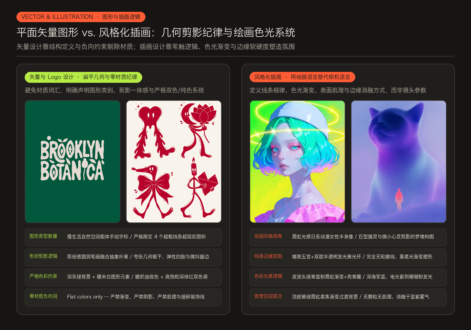
Minimal playful logo on a deep muted green background with warm off-white or cream elements. Flat colors only — no gradients, shadows, or texture. Designed for a slow, nature-focused creative space such as a studio, independent publishing project, or mindfulness platform. Calm, grounded, human, slightly whimsical — never commercial or trendy. Bold hand-drawn chunky wordmark with soft uneven strokes, rounded edges, imperfect spacing, and slightly irregular proportions. Letters feel brush-painted or cut from paper, earthy and intuitive rather than precise. Simple plant-inspired symbols (abstract leaves, berries, seeds) are integrated into or around the lettering — flat, bold, highly simplified shapes with no outlines or fine details. Centered, compact composition forming one unified silhouette with strong legibility. Warm, natural, quietly confident identity. Avoid corporate aesthetics, sharp geometry, thin lines, decorative fonts, or tech styling.- 色彩与平面纪律:深灰绿背景配暖米白/奶油色图形元素,开篇直接锁死
Flat colors only — no gradients, shadows, or texture(仅限纯色,严禁渐变、阴影或肌理)。 - 字形与图形融合:粗壮手绘字标,笔画带有画笔涂刷或剪纸般的圆润边缘与微妙不规则比例;高度简化的无描边叶片、浆果与种子符号嵌入字母内部与周围,居中紧凑排布,形成高识别度的统一剪影。
- 负向风格排除:明确排除企业商务风、尖锐几何、细线条、花哨装饰字体与科技感造型。
案例 B:严格双色调的 4 角色超现实主义图标集
Clean modern illustration icon set featuring exactly 4 ultra-bold surreal character pictograms in a playful contemporary mascot style. Exaggerated geometric bodies, elastic limbs, dynamic confident poses, slightly asymmetrical forms, smooth hand-drawn outlines with a subtle wobble. Minimal facial features — small oval eyes, calm neutral expressions. Personality expressed through posture. Strict two-tone palette only: deep saturated crimson for all characters and graphic elements on a soft warm cream background. Flat vector aesthetic. No gradients, no shading, no texture, no shadows. Include exactly four characters:
 — A tall melting heart with long flexible legs walking forward.
 — A floating crescent-moon-headed figure hugging a large abstract flower.
 — A stretched dachshund-like creature with an oversized bow around its body.
— A tall matchstick-headed character with a tiny flame-shaped head holding a large geometric love letter. Add minimal decorative elements in the same crimson line style: small starbursts, abstract leaves, curved motion lines, and floating petals. Clean, balanced, poster-style composition with strong negative space. No text. No clutter. Bold, graphic, collectible art-print aesthetic.- 数量与造型体系:严格限定 4 个超粗线条超现实主义吉祥物图标(
featuring exactly 4 ultra-bold surreal character pictograms),夸张几何躯干、弹性四肢、带微妙手绘抖动感的平滑轮廓线,靠姿态而非复杂五官传递性格。 - 严格双色系统:暖奶油色背景 + 高饱和深绯红色(Crimson)图形,重申
No gradients, no shading, no texture, no shadows。 - 逐项点名 4 个角色:① 长腿向前迈步的高挑融化爱心;② 怀抱巨型抽象花朵的漂浮弯月头角色;③ 腰系超大蝴蝶结的拉长腊肠犬生物;④ 顶着小火苗脑袋、手捧几何情书的高挑火柴人。
矢量与 Logo 提示词的 6 项核心定义:
- 图形类别(Graphic type):品牌 Logo、图标集(Icon set)、符号系统。
- 形状逻辑(Shape logic):几何特征、对称与非对称关系、外轮廓剪影清晰度。
- 色彩体系(Color system):严格限制色板数量与主辅色搭配。
- 线条纪律(Line discipline):统一的描边粗细、无表面肌理。
- 版式结构(Layout structure):居中紧凑、网格排布、缩放可读性。
- 刚性约束(Constraints):无渐变、无阴影、无立体光效。
2. 风格化与叙事插画(Illustration Strength):定义绘画逻辑而非相机逻辑
在插画场景下,你需要把思维从“摄影机怎么拍”切换到“画笔怎么画”——重点描述绘画流派、线条粗细与软硬、色彩过渡逻辑以及氛围边缘的处理方式。
案例 A:霓虹光感日系动漫女性肖像
Digital anime-inspired neon-lit illustration of a young female from the shoulders up with pale luminous matte skin, short bob-length hair in voluminous rounded layers slightly wavy with a neon gradient of green, cyan, blue, and pink reflecting light. Large almond eyes with bright cyan irises and darker cyan or black pupils, neon-pink eyeshadow on the upper lids, faint eyelashes, faint or absent eyebrows, gaze directed slightly downward and to her right (viewer’s left) with a neutral expression and muted pink slightly parted lips. She wears a white close-fitting rounded helmet-like cap with subtle highlights and a wide raised band around the forehead, along with an off-shoulder garment featuring a puffy neon-pink ruffled shoulder piece on the right shoulder. Her head is tilted slightly to her right (viewer’s left). Two semi-transparent glowing neon-yellow halo rings surround the cap and hair. Three-quarter view, turned slightly to her right. Background is a smooth out-of-focus gradient transitioning from neon green and yellow-green at the top.- 画风与主体视角:受日系动漫启发的霓虹光感数字插画,女性肩部以上四分之三侧面视角,头部微向画面左侧倾斜。
- 色彩与发光结构:苍白哑光发光肤质,蓬松波波头呈现绿、青、蓝、粉的霓虹色光反射渐变;亮青色虹膜配霓虹粉眼影,白色圆润头盔帽与发丝周围环绕两道半透明发光霓虹黄光环,背景为黄绿霓虹平滑柔焦渐变。
案例 B:无轮廓线发光渐变的巨猫灵体与小人
Soft glowing composition of a giant cat-like spirit shape looming behind a tiny simplified human figure. Both forms are built entirely from smooth glowing gradients without outlines or texture. The cat silhouette transitions between deep navy, electric violet, muted magenta, and pale cyan light, while the tiny figure glows softly in coral pink and warm cream tones. The entire scene dissolves into a fog-like blue-lavender atmosphere with no visible surface detail or sharp boundaries. Airy emotional mood, ultra-clean rendering, no grain, no texture, only soft luminous transitions and floating dreamlike gradients.- 造型与边缘规则:巨大的猫形灵体轮廓伫立在微小的简化人形身后;明确声明两个形体完全由平滑发光渐变构成,没有任何轮廓线或表面肌理(
built entirely from smooth glowing gradients without outlines or texture)。 - 色彩过渡与消融:巨猫剪影在深海军蓝、电光紫、柔洋红与浅青色光晕间过渡,小人散发珊瑚粉与暖奶油色柔光,整个场景边缘自然消融进蓝紫雾气中,无颗粒、无锐利边界。
插画提示词的 7 项结构要素:
- 绘画风格(Drawing style):日系动漫、厚涂绘画、平面图形、夸张变形。
- 角色与姿态(Main character and pose):人物比例、朝向与神态。
- 线条表现(Line behavior):干净利落、手绘不规则、粗犷描边或完全无描边。
- 色彩逻辑(Color logic):撞色、渐变过渡或发光色晕。
- 表面处理(Surface treatment):纯平涂、纸张颗粒或水彩晕染。
- 空间层次(Depth structure):渐变喷枪感、阴影柔和度与前景背景消融。
- 情绪基调(Emotional tone):空灵梦境、赛博张力或温情叙事。
四、海报设计:三层结构化提示词拆解
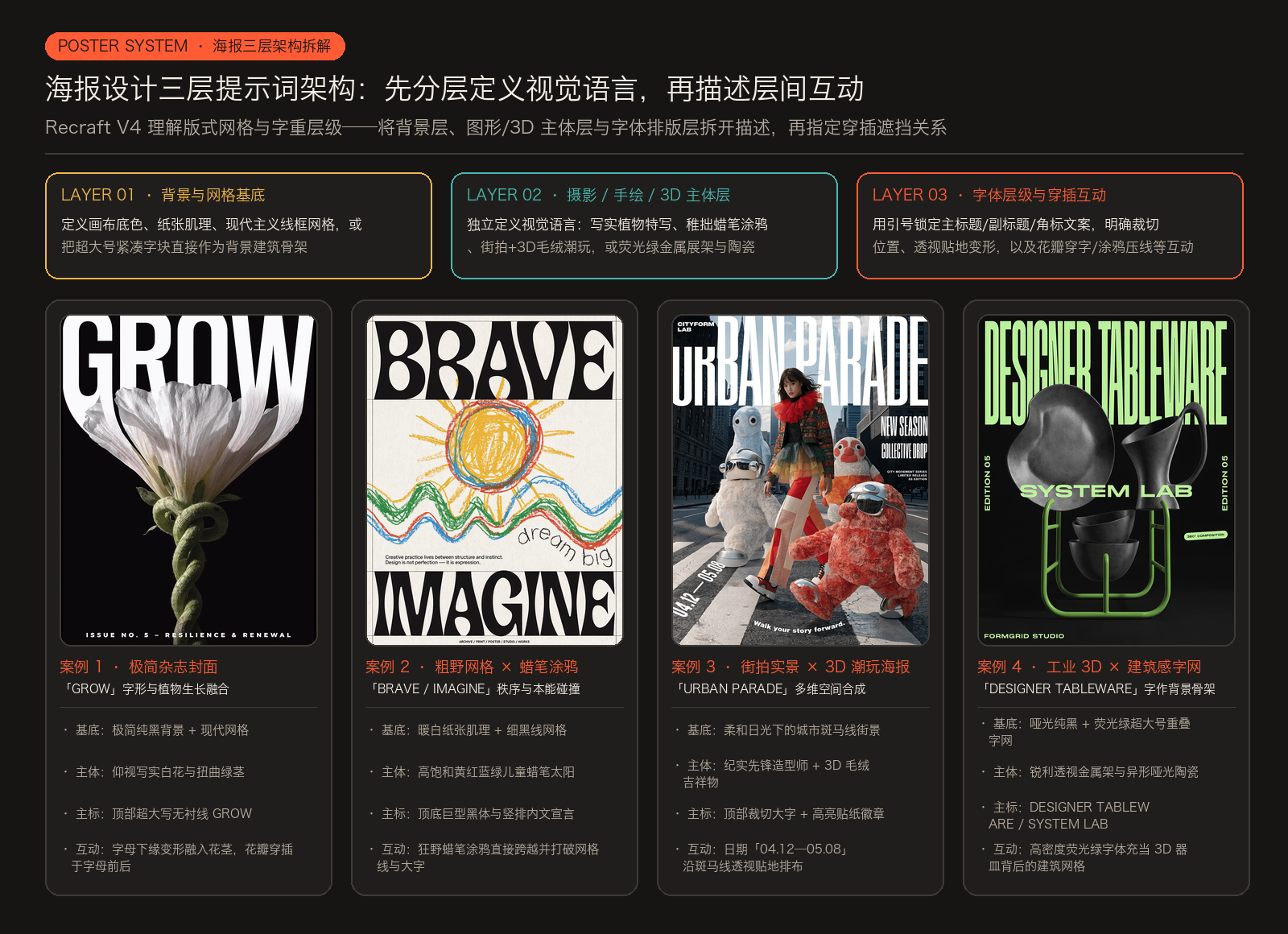
海报与封面设计是 Recraft V4 最令设计师惊艳的领域。模型不仅能看懂单张图,还能理解字体层级(Typographic hierarchy)、视觉重量(Visual weight)与大幅面版式网格。只要你在提示词里把版式逻辑拆清楚,它就会像真正的平面设计师一样搭建版面,而不是把元素随机堆在画布上。
1. 极简现代主义海报系统(Minimal Poster System)
面对摄影或插画与文字结合的海报,最有效的策略是:先分别定义每一层的视觉语言,再描述图层之间如何穿插互动。
案例 A:「GROW」植物生长穿插字形杂志封面
Editorial magazine cover poster. Minimal black background. A realistic flower viewed from below grows upward through the composition, with a thick twisted green stem, small leaves, and soft white petals with subtle pink and yellow tones. The flower passes through the typography, petals spreading behind and between the letters.
Oversized white uppercase sans-serif headline “GROW” tightly cropped at the top, heavy condensed letterforms dominating the upper half. The lower edges of the letters subtly morph and flow into the flower, visually transitioning into the twisted stem. Strong contrast between solid white typography and delicate botanical detail.
Clean modernist grid layout, strong vertical composition with intentional overlap. Add a small refined sans-serif text block “ISSUE NO. 5 – RESILIENCE & RENEWAL” placed at the bottom center of the layout. Quietly powerful, poetic, contemporary editorial aesthetic. High-resolution, print-ready magazine cover.- 底层与主体层:极简纯黑背景;一株写实花朵以仰视角度向上生长,粗壮扭曲的绿茎与带淡粉黄调的白色花瓣纵向贯穿画面。
- 主标题与次级文字层:顶部紧凑裁切的超大写窄体无衬线标题
"GROW"占据上半幅,底部居中放置小号精致无衬线刊号"ISSUE NO. 5 – RESILIENCE & RENEWAL"。 - 图层穿插互动:明确指示花朵穿过字体、花瓣在字母后方与缝隙间舒展,且字母下缘微妙变形并流入扭曲花茎,形成纯白硬朗字体与柔嫩植物细节的强烈对比。
案例 B:「BRAVE / IMAGINE」粗野主义网格与儿童蜡笔涂鸦碰撞
Large-format contemporary graphic design poster combining raw editorial typography with expressive childlike crayon illustration. Warm off-white background with subtle paper grain and a strict grid layout defined by thin black frame lines and vertical divisions. At the top, an oversized tightly kerned bold black word in heavy grotesque sans-serif reads «BRAVE». The center features a naive crayon drawing of a large sun and abstract landscape, made with thick wax strokes in saturated yellow, red, sky blue, and grass green, with uneven pressure and energetic scribbles. The drawing overlaps the grid and typography. Handwritten crayon text near it reads «dream big». At the bottom, another oversized bold word reads «IMAGINE». Between the illustration and lower headline, a narrow vertical column of small clean sans-serif text states: «Creative practice lives between structure and instinct. Design is not perfection — it is expression». Footer in small uppercase sans-serif: «ARCHIVE / PRINT / POSTER / STUDIO / WORKS». Brutalist black typography meets playful crayon art, flat colors, strong contrast, subtle paper texture — structured yet expressive and slightly rebellious.- 底层网格系统:带微妙纸张肌理的暖米白背景,用细黑线框与纵向分割线建立严格的现代主义网格。
- 插画层与涂鸦互动:画面中央是高饱和黄、红、天蓝与草绿色的稚拙儿童蜡笔太阳与抽象风景,笔触轻重不一,直接压过并打破网格线与大字,旁边配有手写蜡笔字
«dream big»。 - 四级文字排布:顶部超大字距紧凑的粗黑无衬线体
«BRAVE»、底部超大粗黑体«IMAGINE»、插画与底部标题之间的窄栏小号内文宣言,以及页脚全大写标注«ARCHIVE / PRINT / POSTER / STUDIO / WORKS»。
极简海报系统的 7 步结构:
- 画幅与媒介(Format and scale):杂志封面、大幅面海报、印刷品。
- 背景底层(Background / visual layer A):底色、纸张肌理与网格线框。
- 图像或图形层(Graphic or image layer B):摄影或手绘主体的独立风格描述。
- 字体层级(Typographic hierarchy):明确哪一组字最大、哪一组字是次要说明。
- 文字位置逻辑(Text placement logic):顶部裁切、居中、贴边、弧形排布或分栏。
- 层间对比(Contrast between layers):粗暴黑体对稚拙蜡笔、纯白实心字对细腻花瓣。
- 整体构图力学(Overall compositional mechanics):穿插、遮挡与留白平衡。
2. 实验性多维视觉海报(Experimental Graphic Poster)
当海报同时混合街拍实景、3D 角色与多向实验排版时,依然遵循“先分层定义元素,再描述空间穿插与运动趋势”的原则。
案例 A:「URBAN PARADE」城市街拍与 3D 毛绒潮玩合成海报
Contemporary fashion campaign poster blending realistic street photography with hyper-detailed 3D characters and bold experimental typography. A wide pedestrian crosswalk in a modern city under soft daylight — detailed asphalt, crisp zebra stripes, natural shadows, cinematic grading. A young avant-garde stylist walks confidently left to right, slightly off-center, captured in documentary realism with wind in the hair and a layered experimental outfit of saturated tones, technical fabrics, metallic accents, and structured tailoring. Plush-tech hybrid mascots move in the same direction along the stripes — one leading, one strong in the foreground, two behind at staggered depths — with ultra-real fur, glossy plastic and chrome details, and precise shadows aligned to the crosswalk. Seamless blend of real photography and CGI. Bold layered typography: “URBAN PARADE” oversized across the top, partially cropped; “NEW SEASON” and “COLLECTIVE DROP” as strong blocks on the right; date “04.12 — 05.08” in perspective along a stripe; curved tagline «Walk your story forward.» near the ground; compact “CITYFORM LAB” logo in the corner. Add large glossy sticker graphics — circular “EXCLUSIVE DROP”, rectangular “STREET EDITION”, diagonal “LIMITED RELEASE”. Strong asymmetry, unified motion, high-fashion meets collectible culture, dynamic editorial poster energy.- 实景摄影层 + CGI 角色层:柔和日光下的城市宽阔斑马线;纪实抓拍的先锋造型师从左向右自信迈步,四周错落排布同向行进的 3D 毛绒机甲混合吉祥物(超写实毛发 + 亮面塑料与镀铬细节),阴影与斑马线地面严丝合缝。
- 多维立体排版与贴纸层:顶部超大写裁切主标
"URBAN PARADE";右侧强字块"NEW SEASON"与"COLLECTIVE DROP";日期"04.12 — 05.08"沿着斑马线透视贴地排布;贴近地面的弧形标语«Walk your story forward.»;角落"CITYFORM LAB"标志,以及圆形、矩形与斜向的高亮贴纸徽章。
案例 B:「DESIGNER TABLEWARE」荧光绿建筑感字网与 3D 雕塑器皿
Bold futuristic product poster combining high-contrast 3D objects with oversized graphic typography. Deep matte black background with all typography in bright electric lime green, ultra-large condensed sans-serif, tightly spaced and partially overlapping, acting as an architectural grid behind the objects. The main concept is an avant-garde designer tableware collection: a single sculptural neon-green powder-coated metal rack structure floats in sharp perspective, displaying a very limited number of highly unusual pieces — one asymmetric fluid-geometry ceramic plate, one tall sculptural cup with an exaggerated curved handle, and one small stack of two organically shaped bowls. The forms are smooth matte ceramic with soft subtle reflections, engineered precision, rounded edges, collectible and artistic rather than purely functional. The objects are carefully spaced with strong negative space, beautifully arranged in an asymmetrical gallery-like composition, balanced and visually refined. Top oversized headline reads “DESIGNER TABLEWARE”, with a second large line crossing the composition: “SYSTEM LAB”. Vertical side typography reads “EDITION 05”. A small rounded badge states “360° COMPOSITION”. Corner logo in clean uppercase sans-serif reads “FORMGRID STUDIO”. Style balance: heavy typography as structural backdrop, minimal sculptural 3D ceramics in sharp perspective, neon green on deep black, clean modern industrial-art aesthetic, bold minimal poster design. Overall mood: experimental design culture — collectible dining objects presented as rare sculptural industrial art.- 字体即背景骨架:深邃哑光黑背景上,所有文字采用电光青柠绿(Electric lime green)超大窄体无衬线字,紧密排列并局部重叠,直接充当 3D 物体背后的建筑感网格背景。
- 3D 雕塑主体层:荧光绿喷塑金属展架以锐利透视悬浮于画面中央,陈列三组异形深灰哑光陶瓷餐具(流体几何餐盘、夸张弯柄高杯、两只叠放的有机形态小碗)。
- 纵横交错的文案层级:顶部主标
"DESIGNER TABLEWARE"、横穿构图的"SYSTEM LAB"、两侧竖排"EDITION 05"、圆角徽章"360° COMPOSITION"与左下角"FORMGRID STUDIO"。
五、3D 立体视觉与实体印刷字效:从物理系统到精确文字渲染
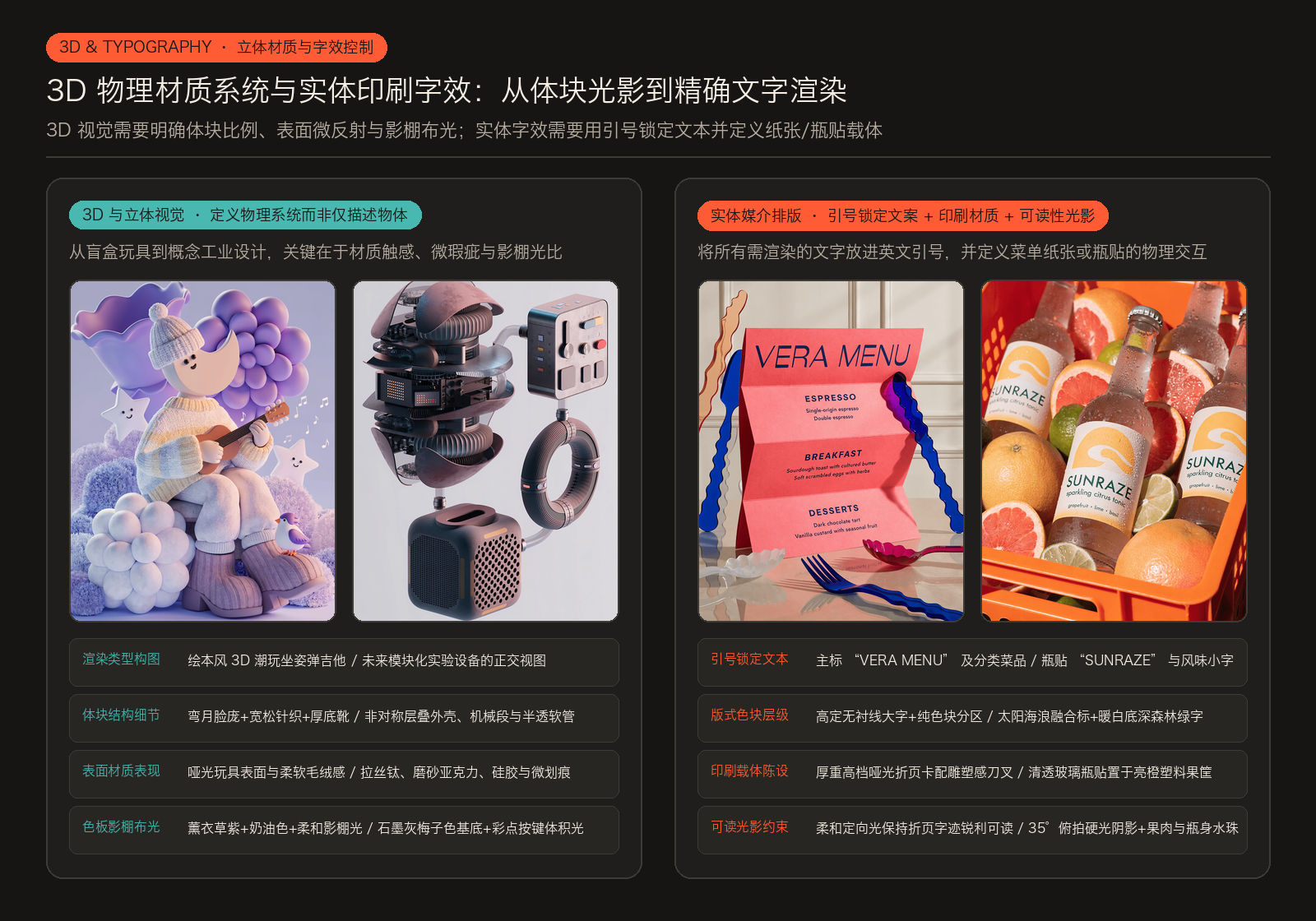
1. 3D 与立体视觉渲染(3D & Dimensional Visuals):定义物理系统而非仅描述物体
如果你在提示词里只写“一个 3D 角色”或“一台机器”,模型只会给出随机的泛化渲染;一旦你把体块比例系统、表面材质的微反射特性、空间环境与影棚布光定义完整,3D 渲染就会呈现出惊人的真实触感。
案例 A:弯月脸庞的绘本风 3D 潮玩角色
Stylized 3D character with a crescent moon face sitting on a rounded stool playing a tiny guitar surrounded by floating musical notes, oversized flowers, smiling stars, soft bushes, and a tiny bird perched nearby. The character wears oversized knit clothing and chunky boots. Dreamy lavender, blue, and cream palette, matte toy-like textures, soft studio lighting, whimsical storybook-style 3D rendering.- 角色造型与道具:弯月形脸庞的风格化 3D 角色坐在圆凳上弹奏迷你吉他,周围环绕漂浮音符、超大花朵、微笑星星、蓬松灌木与小鸟。
- 材质与光影系统:宽松毛线针织衫与厚底靴,梦幻薰衣草紫、浅蓝与奶油色板,明确指定
matte toy-like textures(哑光盲盒玩具质感)与柔和影棚布光。
案例 B:未来主义模块化实验室设备的正交视图渲染
High-detail 3D render of a futuristic modular laboratory device composed of interconnected geometric components, arranged in a clean orthographic composition on a soft light-grey background. The system includes a complex sculptural processing unit with layered asymmetrical shells, rotating mechanical segments, exposed internal structures, and illuminated micro-elements, replacing the liquid chamber. It is combined with a compact interface module featuring tactile sliders and colorful circular indicators, a sculptural ventilation block with perforated surfaces, and a floating ring-shaped connector element, all linked through flexible translucent tubes and metallic joints. Materials are refined and tactile — brushed titanium, frosted acrylic, silicone, matte ceramic, and smoked glass with subtle micro-scratches and soft reflections. Tiny engraved markings, interface symbols, and illuminated indicators add realism and scale. Color palette is pastel and muted — dusty graphite, faded plum, smoky navy, dark sage, muted burgundy, and soft charcoal tones, contrasted with colorful accents in pale orange, muted cyan, butter yellow, soft lavender, and coral red on buttons and interface elements. Soft cinematic studio lighting emphasizes volume, texture, and gentle shadow transitions. Minimal yet visually rich composition, ultra-sharp, noise-free. Style: speculative industrial design, futuristic product visualization, contemporary sci-fi aesthetic.- 视图与模块化架构:浅灰背景上的干净正交构图(
orthographic composition),由非对称层叠外壳处理器、带实体推杆与彩色指示灯的交互模块、穿孔散热块及悬浮环形连接器组成,通过半透明软管与金属接头互联。 - 精密材质与微瑕疵:明确点名拉丝钛金属、磨砂亚克力、硅胶、哑光陶瓷与带微妙划痕(
subtle micro-scratches)的烟熏玻璃,辅以微型蚀刻刻度与发光指示符。 - 工业色板与布光:低饱和石墨灰、暗梅子色、烟熏海军蓝与鼠尾草绿基底,在按键处点缀浅橙、黄油黄与珊瑚红,配合柔和影棚体积光。
3D 视觉提示词的 7 项物理定义:
- 渲染类型(Render type):潮玩盲盒(Designer toy)、电影级 3D、工业产品图录(Lookbook)。
- 体块与比例系统(Form and proportion system):几何结构与夸张或精密比例。
- 材质表面表现(Material behavior):哑光、高光、塑料、织物、拉丝金属或微划痕。
- 空间环境(Spatial environment):地面、纯色背景或环境氛围。
- 光线方向与强度(Lighting direction and intensity):影棚柔光箱、轮廓光与阴影柔和度。
- 机位与景深(Camera angle and depth):正交视图(Orthographic)、透视特写或浅景深。
- 色彩体系(Color system):基底材质色与高饱和功能点缀色。
2. 实体媒介中的文字与包装排版(Working with Text)
Recraft V4 处理画面内建文字的能力远超大多数生成模型,秘诀在于:不要只抛出一句孤立的口号,而是定义完整的排版层级与物理印刷载体,并将所有需要原样渲染的文字放进英文引号中。
案例 A:「VERA MENU」高定艺术餐厅折页菜单设计
Bold avant-garde café menu design in a luxury editorial style, photographed in an elevated, design-forward table setting. A large-format folded or partially unfolded menu card dominates the frame as the clear focal point, printed on thick premium matte paper with crisp edges and precise folds, placed on polished stone, lacquered wood, or tinted glass. The headline “VERA MENU” appears oversized and highly legible in an expressive high-fashion sans-serif with sculptural yet clean letterforms. The content is grammatically correct, clearly structured, and professionally written in proper English, with large evenly spaced typography and no filler text: sections such as ESPRESSO (Single-origin espresso, Double espresso), BREAKFAST (Sourdough toast with cultured butter, Soft scrambled eggs with herbs), and DESSERTS (Dark chocolate tart, Vanilla custard with seasonal fruit). Use a vivid high-impact palette — saturated coral, electric pink, deep cobalt blue, warm orange, and creamy off-white — with strong color blocking only, no gradients, and a disciplined typographic hierarchy. Surround the menu with minimal sculptural avant-garde cutlery featuring exaggerated forms and refined finishes. Soft directional editorial lighting creates subtle shadows while keeping the menu surface and typography crisp and fully readable. Overall impression: avant-garde luxury dining where graphic design meets contemporary art — bold, refined, collectible, no real brands, no clutter, focused on scale, clarity, and sculptural composition.- 物理载体与陈设:厚重高档哑光纸印制的大幅面三折页菜单卡立于抛光石面餐桌上,折痕挺括,四周摆放夸张波浪造型的钴蓝色与酒红色先锋雕塑感餐具。
- 引号锁定三级精确文本:顶部超大号高定无衬线主标题
"VERA MENU",下方依次清晰排出分类标题与具体菜品:ESPRESSO(Single-origin espresso,Double espresso)、BREAKFAST(Sourdough toast with cultured butter,Soft scrambled eggs with herbs)与DESSERTS(Dark chocolate tart,Vanilla custard with seasonal fruit),明确要求无乱码占位符(no filler text)。 - 色块与可读性布光:高饱和珊瑚粉、电光粉、深钴蓝纯色块分区,柔和定向光既投出折页立体阴影,又保证纸面每一行小字清晰可读。
案例 B:「SUNRAZE」果筐中的气泡柑橘汤力水商业包装摄影
Studio food photography of a premium sparkling beverage in clear glass bottles with matte labels. The bottles are placed diagonally inside a bright orange plastic fruit crate. Around and between the bottles are fresh grapefruits and limes, some cut open with visible juicy pulp and small droplets of moisture.
Minimalist label design featuring a bold graphic symbol of a sun merging with a wave. Text on the label reads: “SUNRAZE”, “sparkling citrus tonic”, “grapefruit · lime · basil”. The label background is soft off-white with warm yellow accents, typography in deep forest green.
Hard directional lighting creates strong shadows from the crate structure. High contrast, detailed citrus skin texture, visible condensation on the glass. Camera angle slightly top-down (about 35°), focus on the central bottle, shallow depth of field. Clean commercial aesthetic, ultra-detailed, sharp focus, natural color grading, high-resolution advertising photography.- 包装载体与场景道具:装在亮橙色塑料果筐里的透明玻璃瓶装气泡饮品,斜向陈列,瓶身周围塞满新鲜切开的红柚与青柠,果肉饱满且挂满细小水珠。
- 瓶贴图形与引号文本:哑光瓶贴采用柔和米白底色配暖黄图形(太阳与海浪融合的极简标志),深森林绿字体依次印出
"SUNRAZE"、"sparkling citrus tonic"与"grapefruit · lime · basil"。 - 商业硬光与机位:约 35° 微俯拍视角,焦点锁在中央玻璃瓶上,硬朗定向光打出果筐网格投影,清晰呈现柑橘表皮肌理与玻璃瓶外壁的冷凝水珠。
实体字效提示词的 8 项黄金清单:
- 媒介格式(Format type):餐厅菜单、杂志内页、瓶贴包装、展览海报。
- 主标题定义(Primary headline):字号体量、字体风格与摆放位置。
- 次级信息层级(Secondary hierarchy):分区小标题、菜品或成分说明的排布秩序。
- 色块分割逻辑(Color blocking logic):底色与字色的明度反差、纯色分区。
- 印刷表面与材质(Print surface and material):厚哑光卡纸、挺括折痕、透明玻璃贴标。
- 空间陈设(Spatial placement):桌面道具、果筐容器或周围环境的呼应。
- 可读性光影约束(Readability constraints):要求光线保持纸面或瓶贴文字锐利可读。
- 全量英文引号包裹(Quotation marks):把所有必须精准渲染的单词和词组放进引号内。
六、总结:设计师的提示词思维框架
Recraft V4 会自动适配你的思考清晰度:
- 写短提示词时,模型与你共同设计(Model designs with you):适合发散探索造型、色彩情绪与意外构图。
- 写结构化长提示词时,模型严格执行你的视觉架构(Model executes your architecture):适合把控商业落地的版式层级、材质物理表现与多图层穿插。
面向设计师的提示词工程,从来不在于堆砌冗长的辞藻,而在于清晰定义五个维度:结构(Structure)、材质表面(Surface)、空间(Space)、视觉层级(Hierarchy)与边界控制(Control)。你的视觉思考越明确,生成的作品就越稳定、越考究。